Documentation
Elixi - the modern digital Prestashop theme
Thank you so much for purchasing our item from themeforest.
- Version: 1.0.0
- Author: ThemeVec
- Email: thl231195@gmail.com
Requirements
Prestashop:Our theme works best in Prestashop from version 1.7.6. We recommend using latest Prestashop version.
PHP configuration:- PHP version: We recommend PHP 7.2 or later. See Pretashop - PHP compatibility
- memory_limit should be at least 128M (256M recommended)
- post_max_size should be at least 1M
- file_max_upload_size: 16M
- allow_url_fopen: on
- allow_url_include: off
- register_globals: off
Apache modules:
- mod_rewrite: on
- mod_security: off
- mod_auth_basic: off
- CURL. The Client URL extension is used to download remote resources like modules and localization packages.
- DOM. The DOM extension is needed to parse XML documents. PrestaShop uses it for various functionalities, like the Store Locator. It is also used by some modules, as well as the pear_xml_parse library.
- Fileinfo. The File information extension is used to find out the file type of uploaded files.
- GD. The GD extension is used to create thumbnails for the images that you upload.
- Iconv. The ICONV extension is used to convert character sets.
- Intl. The Internationalization extension is used to display localized data, such as amounts in different currencies.
- JSON. The JSON extension is used to manage JSON format.
- Mbstring. The Multibyte string extension to perform string operations everywhere.
- OpenSSL. The OpenSSL extension is used to improve security.
- PDO. The PHP Data Objects extension is used to connect to databases.
- PDO (MySQL). The PDO_MYSQL driver is used to connect to MySQL databases.
- SimpleXML. The SimpleXML extension is used to manage XML files.
- Zip. The Zip extension is used to expand compressed files such as modules and localization packages.
Permissions
- Permissions for all files should be set to "644"
- Permissions for all folders should be set to "755"
Install theme
Follow the steps below to install our theme on your site:
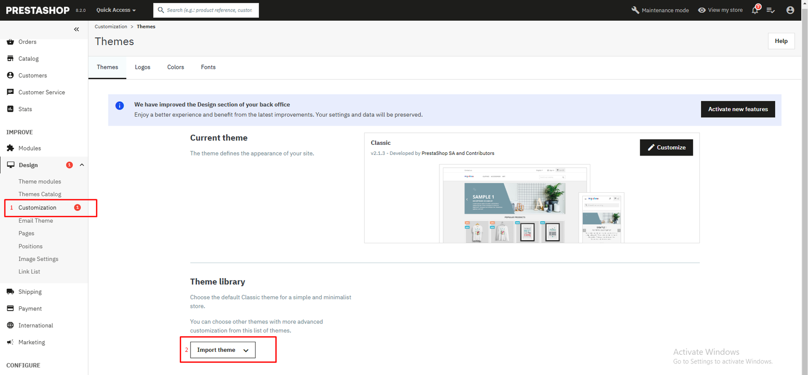
- Go to the PrestaShop admin panel > Designs > Customization
- Click "Import theme"
- Import theme: There're 2 ways to continue installing:
-
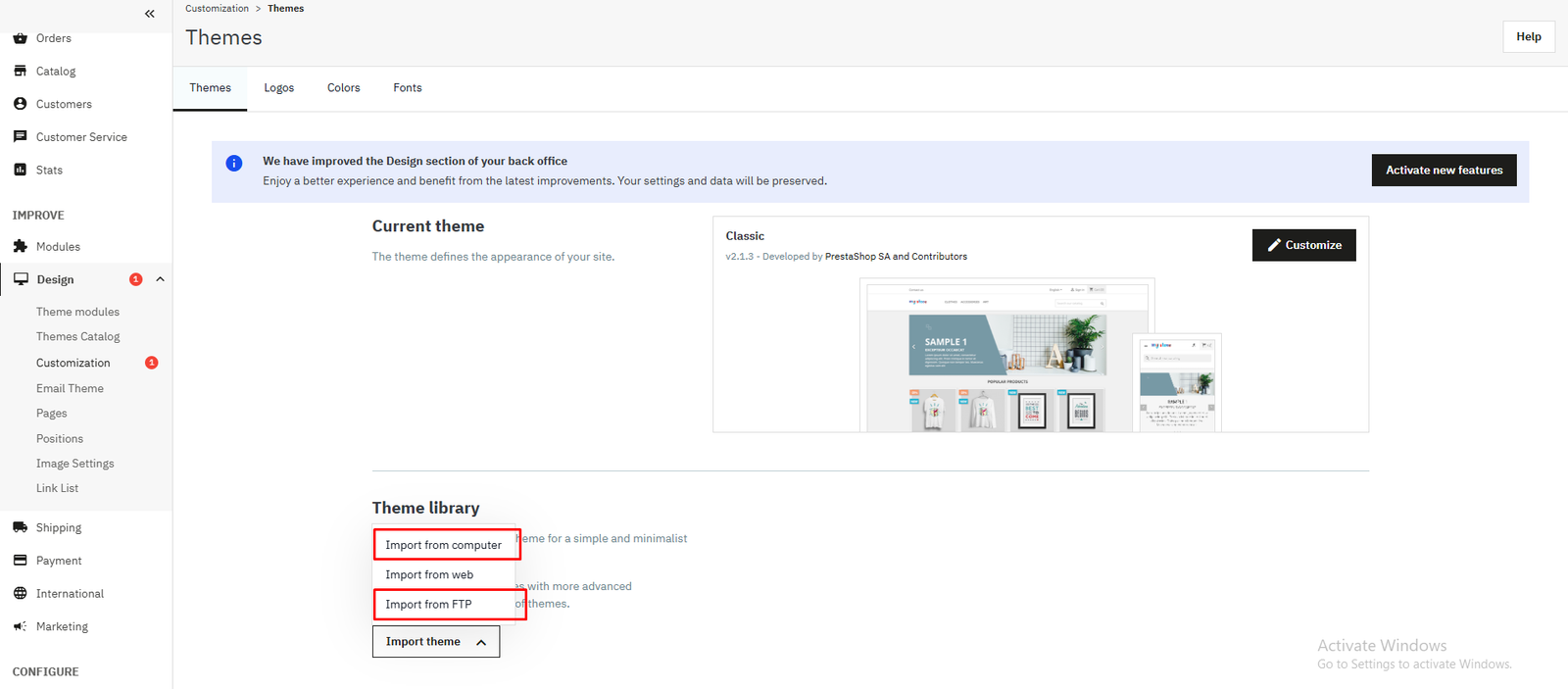
Method 1 : Import from computer
- In "Import from computer" section, Browse the files on your computer and select the ZIP file containing your new theme., then press "Import".
-
Method 2 : Import from FTP
- Upload the theme file (theme_Elixi_v1.0.0.zip) via FTP. The theme file has to be uploaded to /themes folder.
- In "Import from FTP" section, click to select Elixi theme, then press "Import".
- Activate theme: hover mouse on our theme and click "Use this theme".
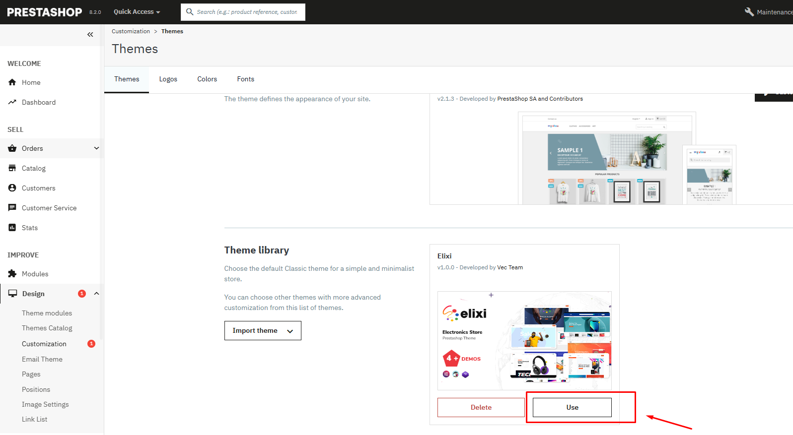
- - Default theme is Home 1
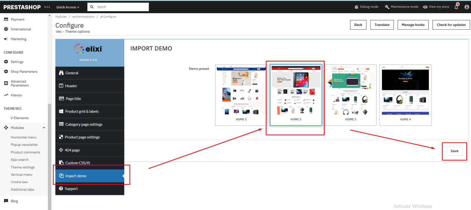
- TO INSTALL OTHER DEMO, PLEASE FOLLOW STEPS BELOW:
- THEMEVEC > Modules > Theme settings
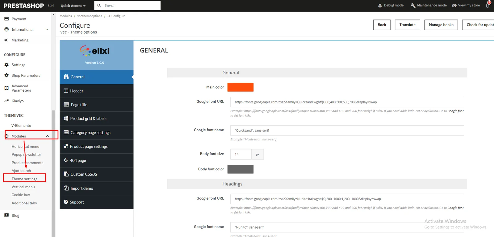
- Choose Import demo : Choose demo (which has not been imported yet) you want to import then click Save button. Example, here: import Home 2 demo. If the demo has already been imported, skip this step.
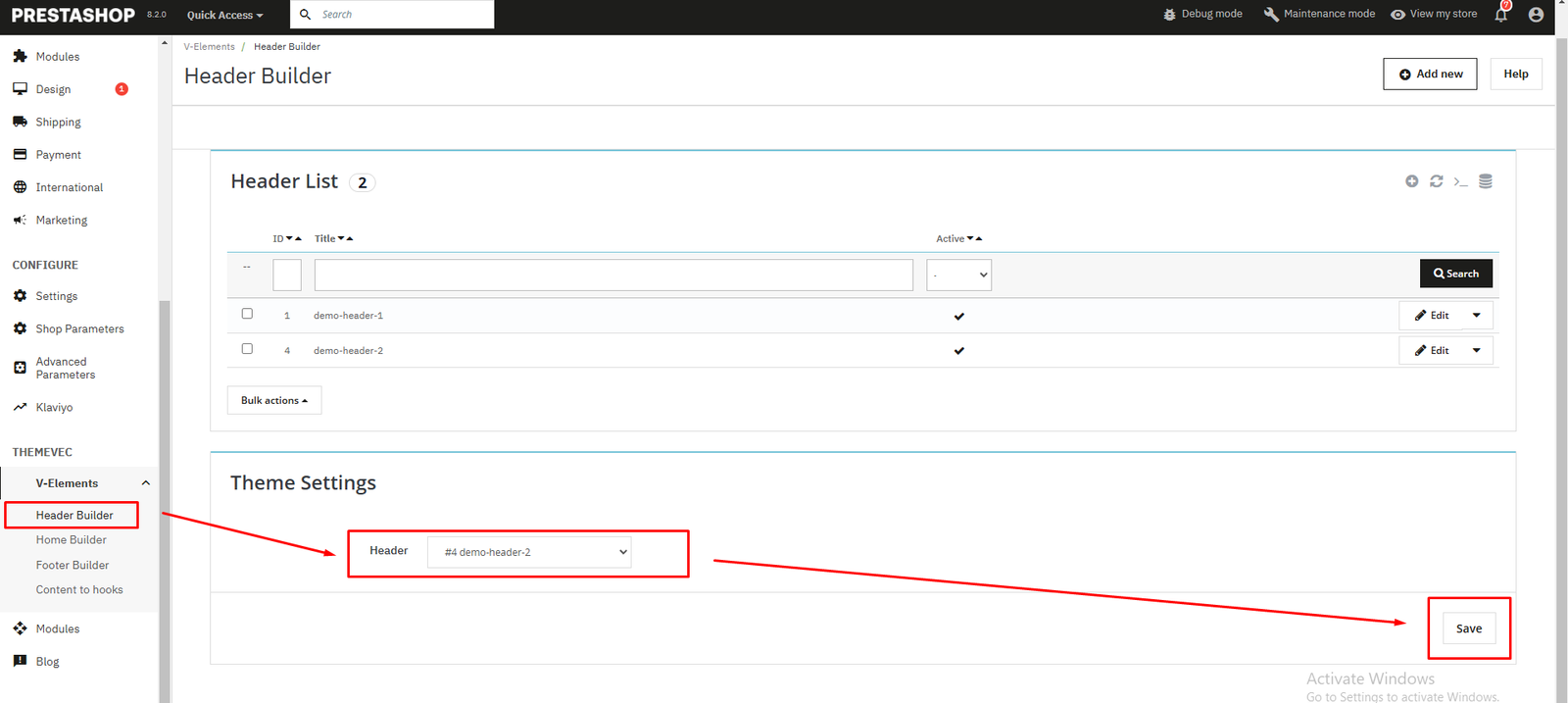
- Header
In Prestashop Dashboard, go to V-Elements > Header Builder
In Settings section, select header layout you want to use, then Save
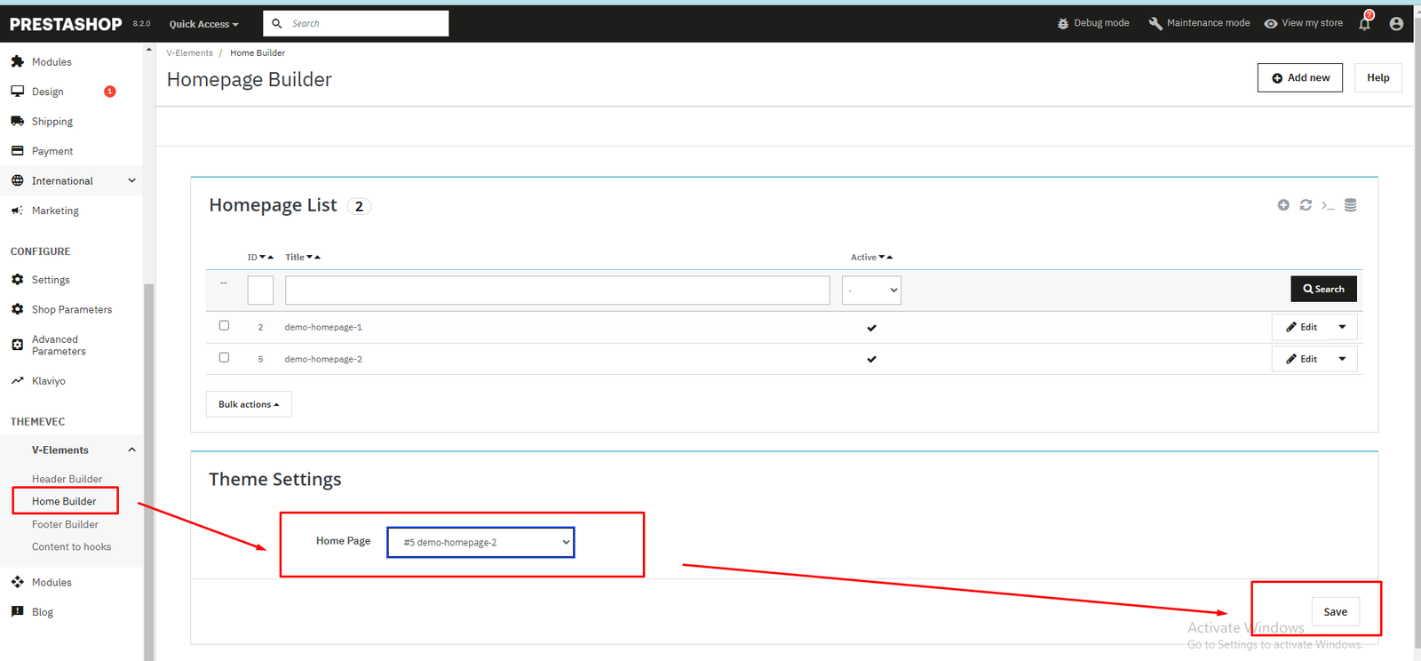
- Homepage
In Prestashop Dashboard, go to V-Elements > Home Builder
In Settings section, select homepage layout you want to use, then Save
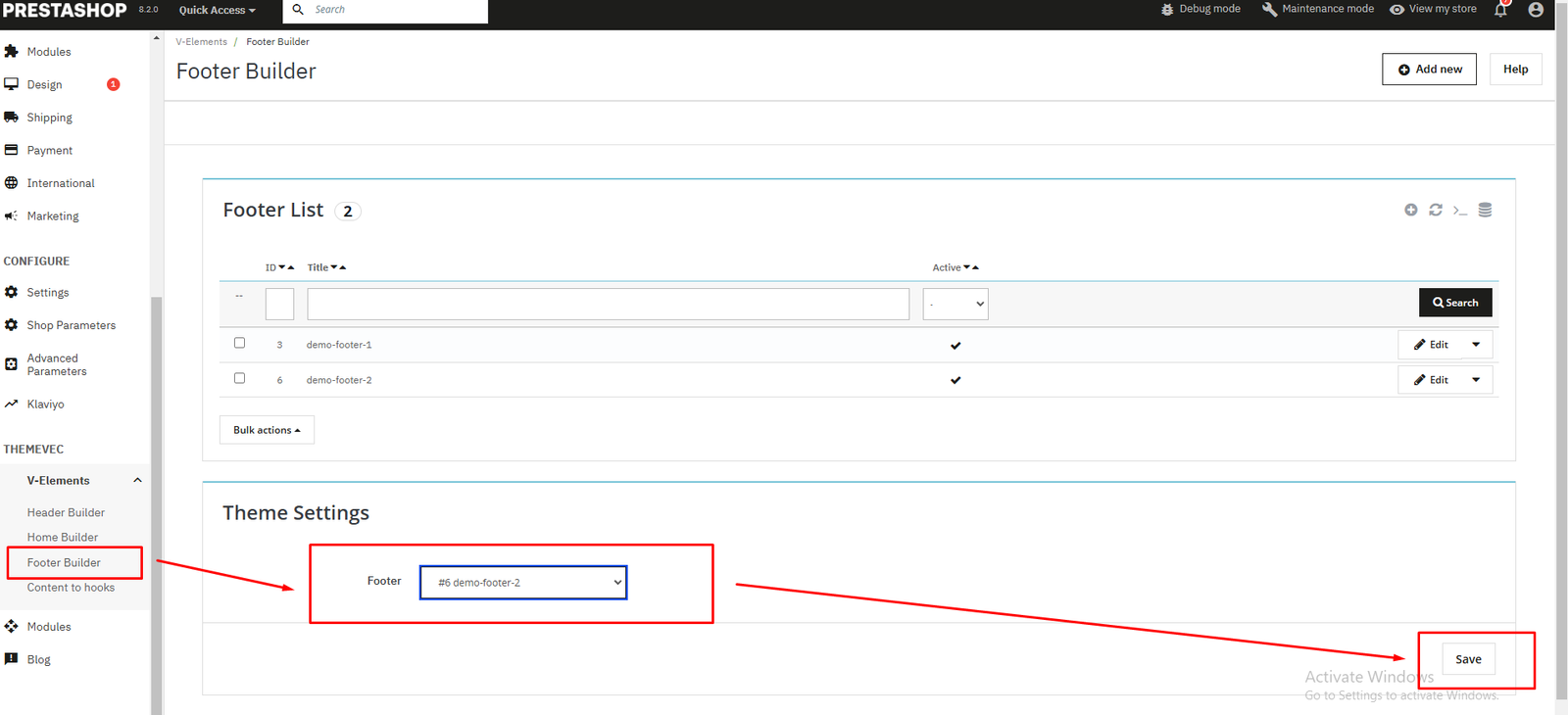
- Footer
In Prestashop Dashboard, go to V-Elements > Footer Builder
In Settings section, select footer layout you want to use, then Save
- THEMEVEC > Modules > Theme settings
- Complete: Enjoy your new website

Smarty Elements - Live page builder
Our theme is built bases on "Smarty Elements - live page builder" module which is based on Wordpress Elementor plugin.
Smarty Elements is used to:
- Build the header
- Build the homepage content
- Build the footer
- Create CMS page content
- Create products/categories/brands/suppliers description
Theme Builder
We use Smarty Elements page builder to build the Header, Homepage and Footer contents.
In Prestashop Dashboard, go to V-Elements > Header Builder

Configuration:
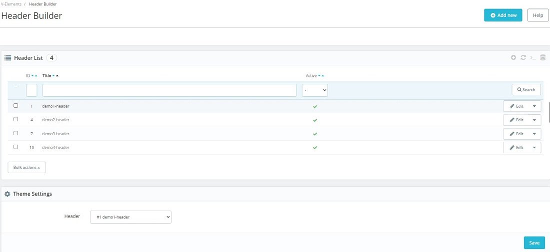
- Click "Add new" to add a new header
- In Header List section, you can Edit the header templates
- In Settings section, select a header from Header List you want to use in frontend, then press Save
Do same for Home builder and Footer builder.
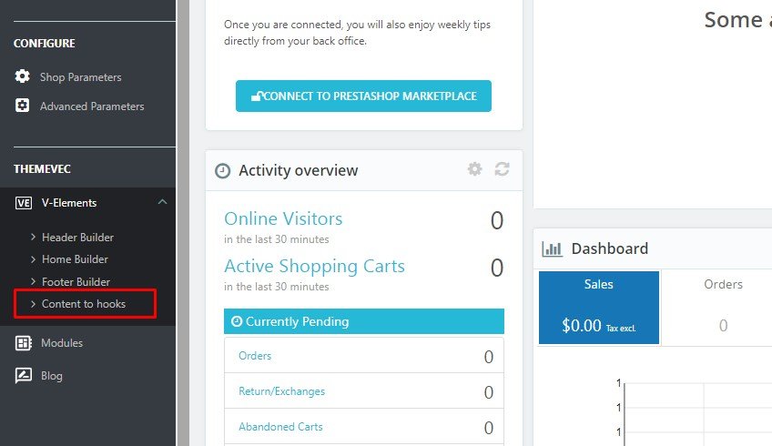
Content to hooks
The "Smarty Elements" module allows you create custom content to some hooks.
In Prestashop Dashboard, go to V-Elements > Content to hooks. Then click "Add new" button to create a new template.
Configuration
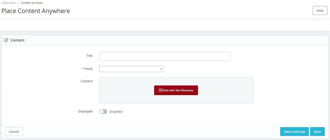
- Title: Add the title for this template
- Hook: Select a hook which you want to display template.
- Display: Active/deactive template
To use Smarty Elements, you have to save template first. After that, you can click "Edit with Smarty Elements" to create content of template.
Frequently questions about Smarty Elements
A FAQ is a list of frequently asked questions (FAQs) and answers on a particular topic.
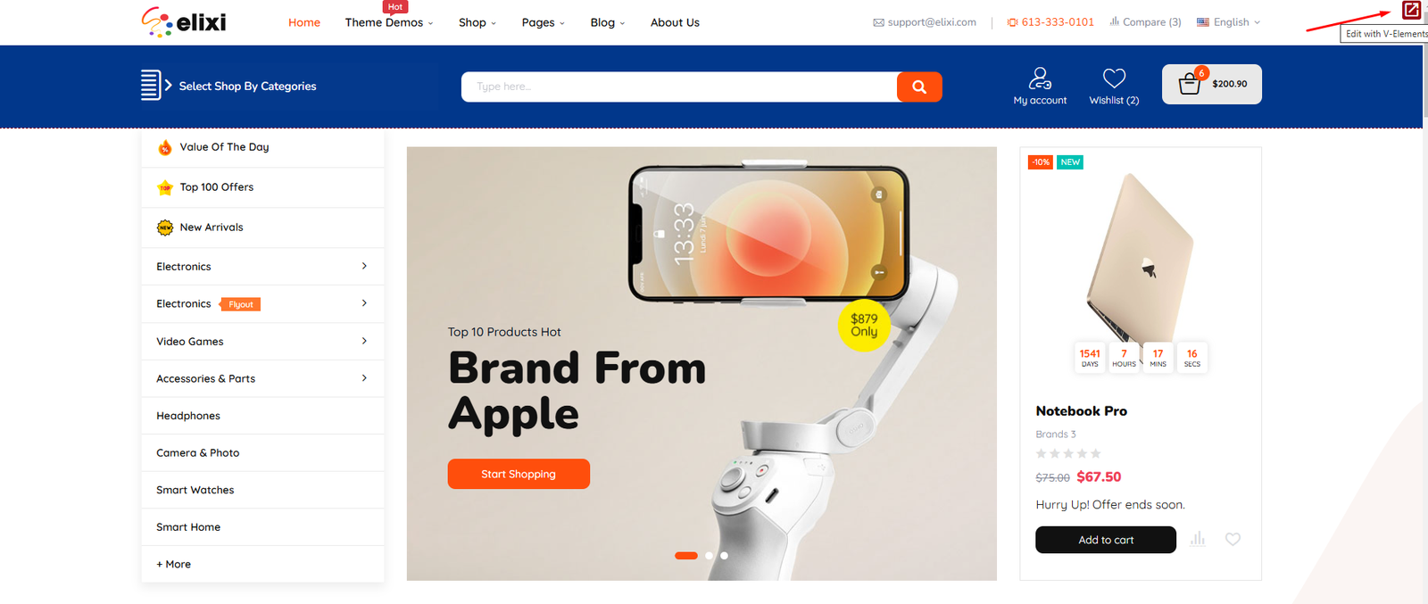
You don't have to edit template from Backend. You can have a quick access from frontend.
In frontend, when you hover on header/home/footer, you will see the Quick edit icon  at top-right. Just click on it to edit with Smarty Elements.
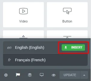
 in footer panel, then click "Insert" to copy from a language to current language.
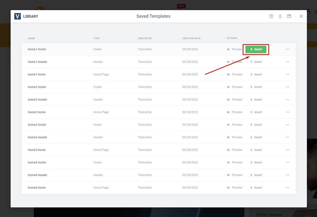
You can save a section or a template to use it later.
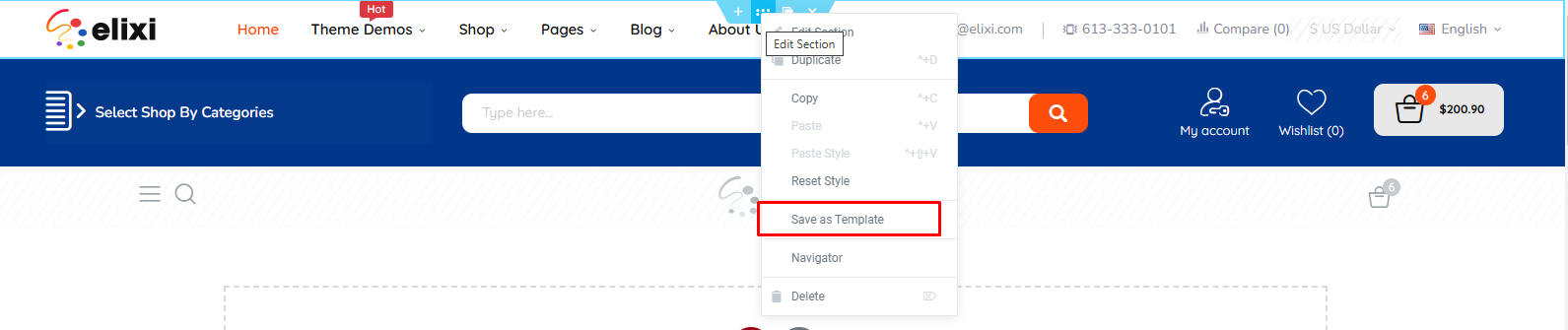
- Save a section
Right click on section which you want to save. Then click "Save as Template". After that, enter the template name and press "Save".
The section will be saved as a template.
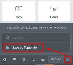
- Save a template
Click arrow button beside "Update" button. Then click "Save as Template". After that, enter the template name and press "Save".
At bottom of current template, click "Add template"  button.
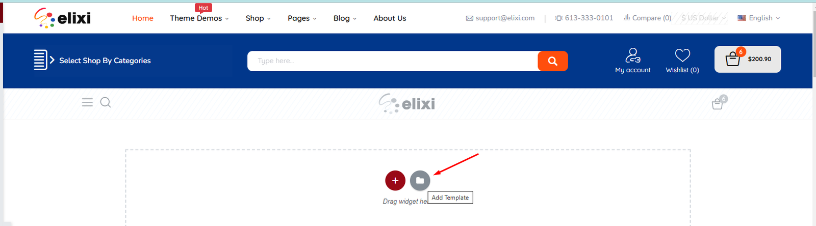
Then, click "Insert" button to insert saved template to your current template.
Theme Modules
This is our modules list:
- V-Elements - Live page builder
- Vec - Shopping cart
- Vec - Popup Newsletter
- Vec - Megamenu
- Vec - Vertical Menu
- Vec - Product Comments
- Vec - Compare
- Vec - Wishlist
- Vec - Search bar
- Vec - Theme options
- Vec - Customer "Sign in"
- Vec - Viewed products block
- Vec - Product Additional Tabs
- Vec - Cookie Law
Theme Settings
1. General
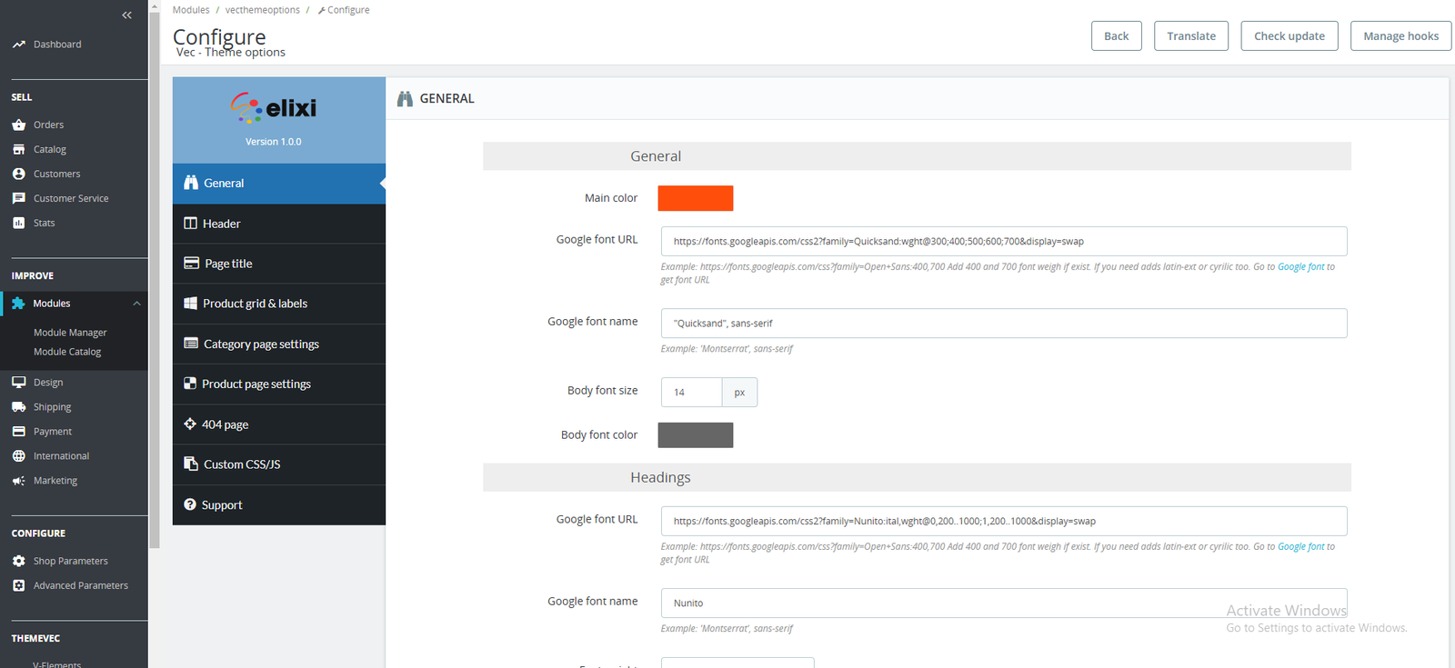
General: This section contains the general website configurations
- Main color: the main color of the website
- Google font URL: Add the Google font which you want to use in the website
- Google font name: Add the Google font name
- Body font size: main text font size of whole website
- Body font color: main text color of whole website

Button: This section contains the primary button configuration.
2. Header
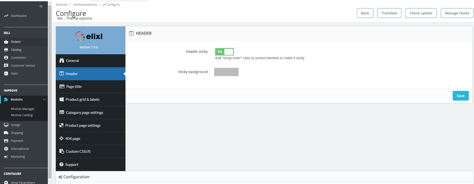
- Header sticky: activate the sticky header. To make a header section sticky when scrolling down, you have to add "sticky-inner" class to that header section.
- Sticky background: select background color for sticky header.
3. Page title
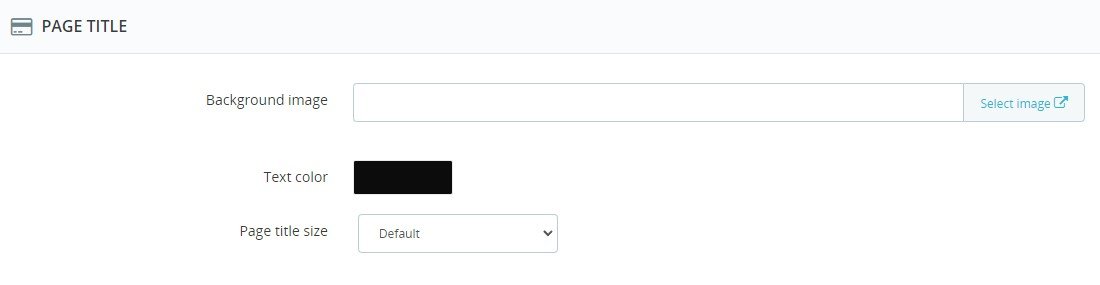
- Background image: Select image from the website gallery.
- Text color: text color of title and breadcrumb.
- Page title size: We defined few sizes.
- Small: the page title section has 110px height.
- Default: the page title section has 155px height.
- Large: the page title section has 230px height.
4. Product grid & labels
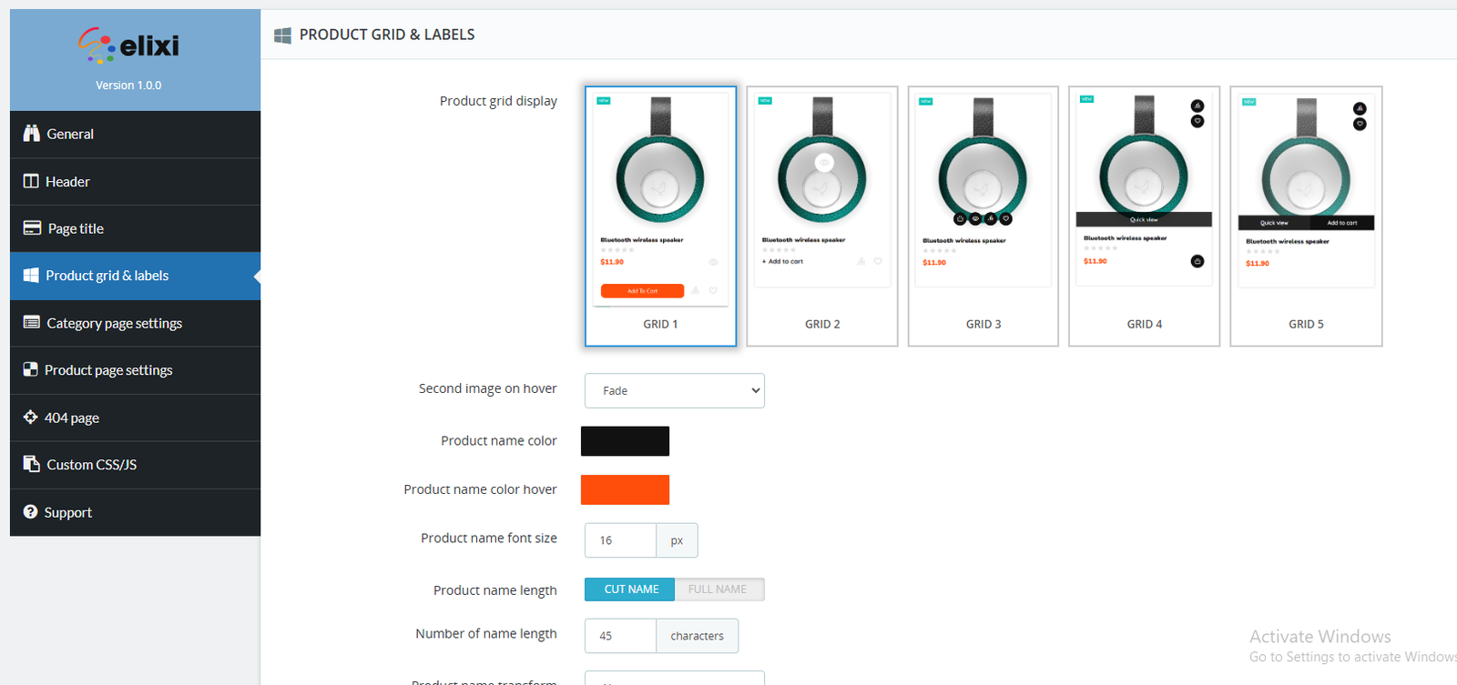
- Product grid display: Select product grid display.
- Second image on hover: Show second image when hovering on product.
- Disabled: don't show second image.
- Fade: show second image with fade animation
- Zoom: show second image with zoom in animation
- Product name color: select a color for product name.
- Product name color hover: select a color for product name when hovering on product
- Product name font size: product name font size
- Product name length: display product name. There're 2 options:
- Cut name: cut the product name
- Full name: show full name
- Number of name length: number of name when you select "Cut name" of "Product name length"
- Product name transform: product name text transform.
- Price color: color of price
- Price size: font size of price
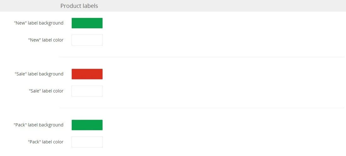
You can select color and background for product labels: "new", "sale" and "pack"
5. Category page settings
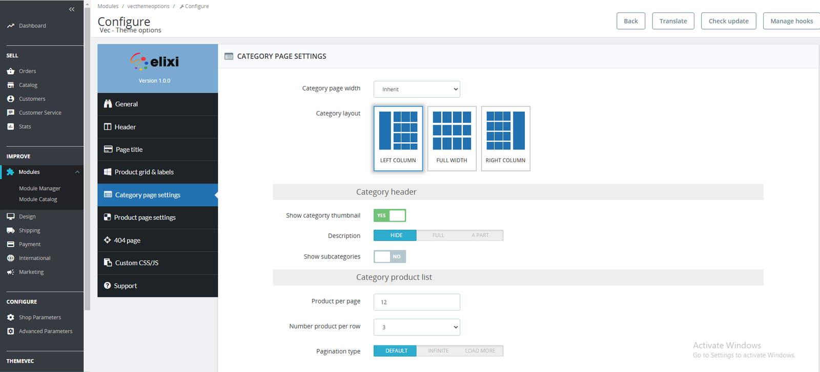
- Category page width:
- Inherit: use width of website general
- Custom width: make a custom width for category page.
- Category layout: select layout for category page: use left column, no column or use right column
- Show categorty thumbnail: show category thumbnail, this image use "Category cover image" in category configuration. This image use "category_default" image size.
- Description:
- Hide: don't show the description
- Full: show full description.
- Apart: show a part of description, customer can click to expand full description.
- Show description in bottom: show description in bottom of page. This option only appears when you select show "full" or "apart" with description
- Show subcategories: show subcategories of category if they're exist. The subcategories will be shown in carousel.
- Product per page: number of product per page
- Pagination type: pagination for category page
- Default: use default pagination page.
- Infinite: scroll infinite to view products
- Load more: use Load more button to show more products.
6. Product page settings
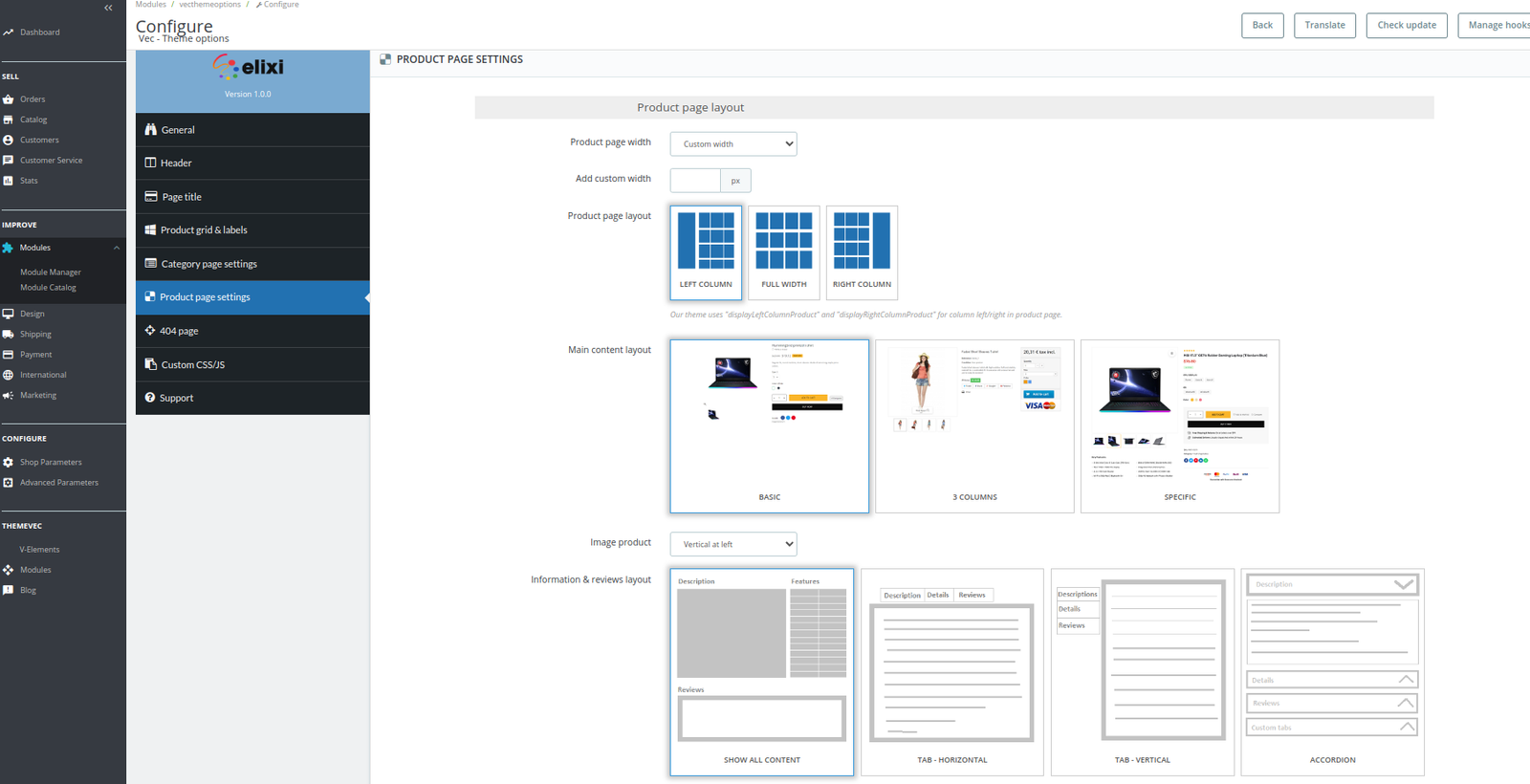
- Product page width:
- Inherit: use width of website general
- Custom width: make a custom width for category page.
- Product layout: select layout for category page: use left column, no column or use right column
- Main content layout: we pre-defined 3 layouts for main content of product. You can select one of them.
- Image product: thumbnail of products display
- Horizontal in bottom: Default. The thumbnails are shown at bottom of main image.
- Vertical at left: the thumbnails are shown vetical at left side.
- Vertical at right: the thumbnails are shown vetical at right side.
- Information & reviews layout: we pre-defined 4 layouts for these content. You can select one of them.
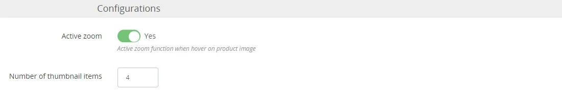
- Active zoom: this option allow to remove zoom functionality when hovering on product image.
- Number of thumbnail items: number of thumbnails. Default is 4.
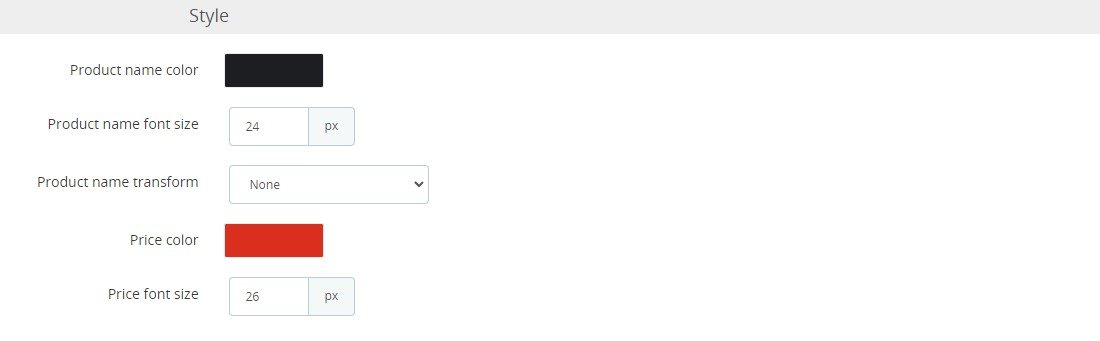
- Product name color: select a color for product name.
- Product name font size: product name font size
- Product name transform: product name text transform.
- Price color: color of price
- Price size: font size of price
7. 404 page
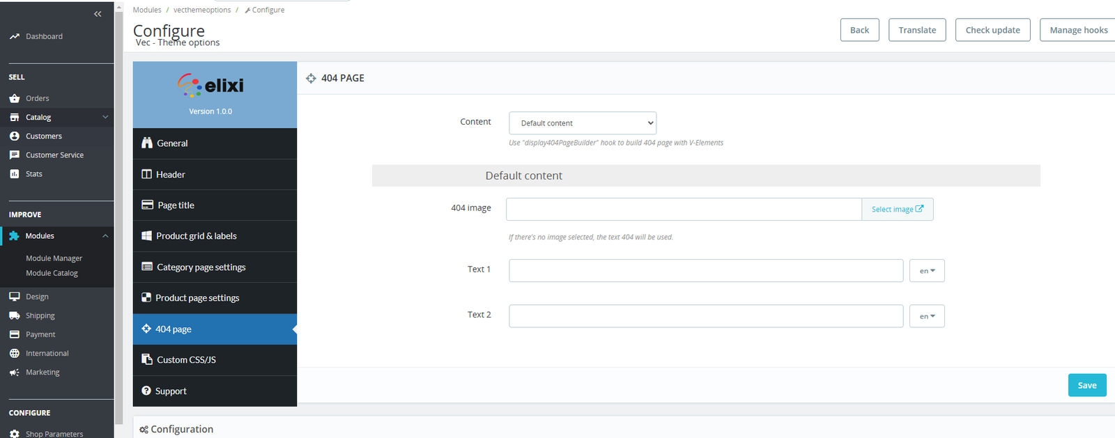
- Content:
- Default content: use default content
- Use content from V-Elements: you can use Smarty Elements module to create the 404 page content.
- 404 image: select image from website gallery
- Text 1: change the first line text. Leave empty to use default text.
- Text 2: change the second line text. Leave empty to use default text.
8. Custom CSS/JS
Horizontal/Vertical menu
The horizontal menu and vertical menu have same structure. So, this guide is applied to both modules.
1. Create a menu item

- Active: Yes/No status of item
- Title: Add the title for this item. Don't forget add title for each language if you're using multiple languages.
- Type link: Select a type of link. Contains:
- Prestashop link: select this, then "PrestaShop Link" selection will appear under, you can select a link from Prestashop core.
- Custom link: select this, then "Custom links" field will appear under, you can add a custom link to this item.
- None: there's no link for this item menu.
- Use icon: Use icon in this menu item. There're 3 selections:
- 1. No: Don't use icon
- 2. Theme & Awesome icons: Select this, the "Theme & Awesome icons" selection will appear, it allows you select an icon from theme icons and awesome icons.
- 3. Image icon: Select this, the "Image icon" field will appear, it allows you select an image from your website media library.
- Item label: Allow add a small label beside the menu item
Example:
- Item label style: Allow add color and background style for item label.
- Add specific class: Add a specific class for custom CSS/JS.
- New window: Open the link in same window or new window
- Submenu type: Define the submenu of item. There're 3 selections:
- 1. Mega: Allow create the submenu in multiple type.
- 2. Fylout: Allow create the submenu in flyout type.
- 3. None: Don't use submenu in this item.
2. Build submenu
After you create the menu item and select submenu type Mega or Flyout. You can click "Build Submenu" in menu items list to build the submenu.
2.1 - Mega type
Frontend display:
Backend configuration:
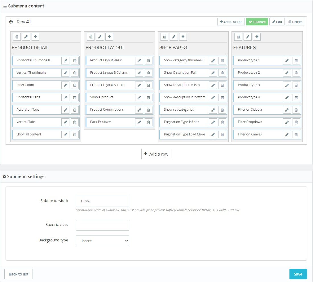
Some notes for mega submenu:
- You can change position of items in a column, position of columns in a row and position of the rows by "Drag and Drop".
- You should add title for each columns, the title will be useful in mobile menu.
- The "Category tree" type item will be a multiple level item.
- Don't forget to add width of submenu.
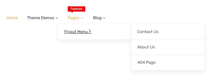
2.2 - Flyout type
Frontend display:
Backend configuration:
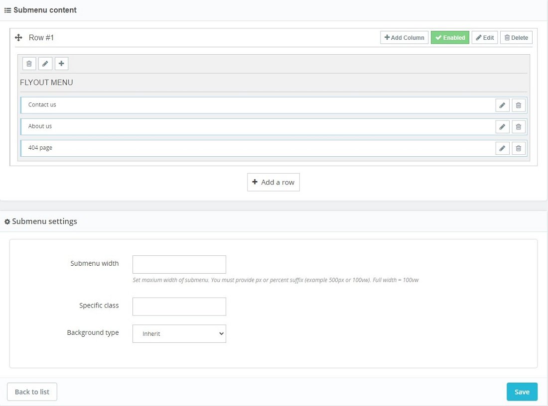
Some notes for flyout submenu:
- Use 1 column with 12/12 width per row. You can use multiple columns per row or multiple columns on multiple rows.
- The title of column will be first level of flyout submenu.
- The "Category tree" type item will be a multiple level item.
- The flyout submenu width is constant (250px) . The submenu width is not affect to flyout submenu width.
Blog
Our theme is using Smartblog module from SmartDataSoft
1. Settings: General
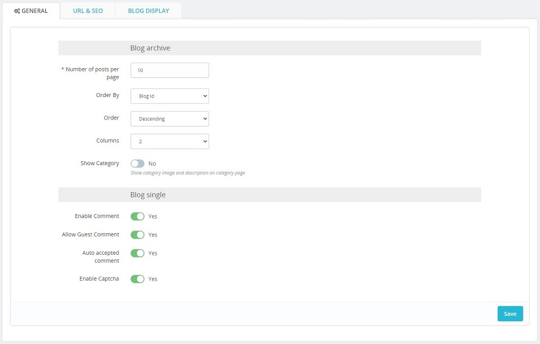
- Blog archive: configurations for blog page and blog category pages.
- Number of posts per page: How many posts display per page. Default: 10
- Order By: Order of posts in blog page.
- Order: Order way ascending or descending
- Columns: Number of posts per row. Default: 2
- Show category: Show category image and description on category page
- Blog single: configuration for blog detail page.
- Enable Comment: Activate the comment in post.
- Allow Guest Comment: Allow the guest to comment on post. Select No: only customer can add comment.
- Auto accepted comment: Auto accept and show comment on post. Select No: the comment need to be approved.
- Enable Captcha: Activate the captcha for comment.
2. Settings: URL & SEO
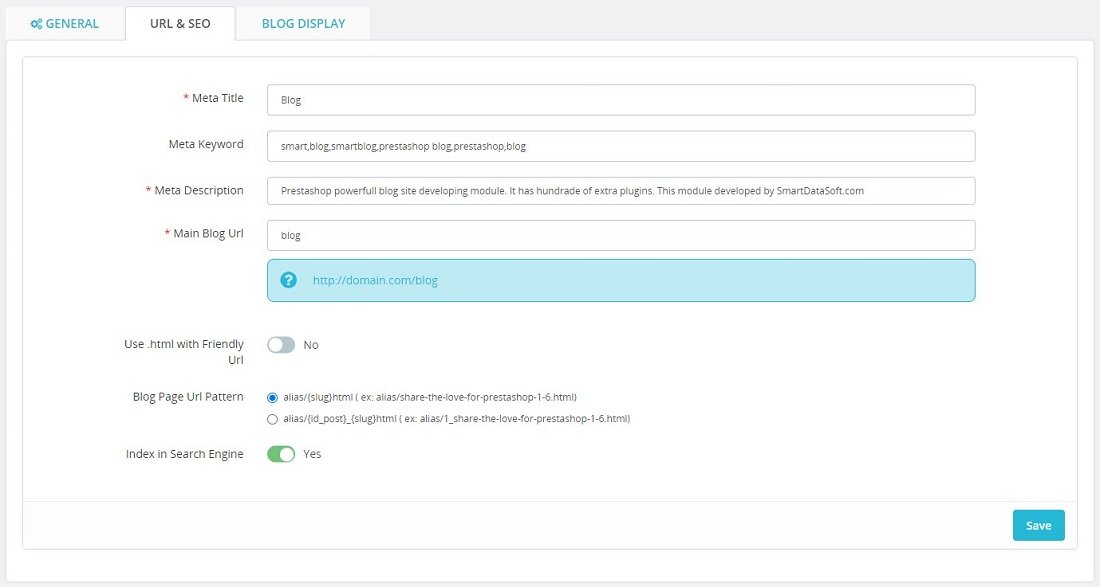
- Meta Title: add blog title
- Meta Keyword: add blog meta keyword. lease enter the index words separated by a command symbol ( , ). Example : keyword1 , keyword2, keyword3
- Meta Description: add blog meta description.
- Main Blog Url: change main blog URL.
- Use .html with Friendly Url: use .html at end of post URL.
- Blog Page Url Pattern: select pattern of post URL which you want to us.
- Index in Search Engine: index blog in search engine.
3. Settings: Blog display
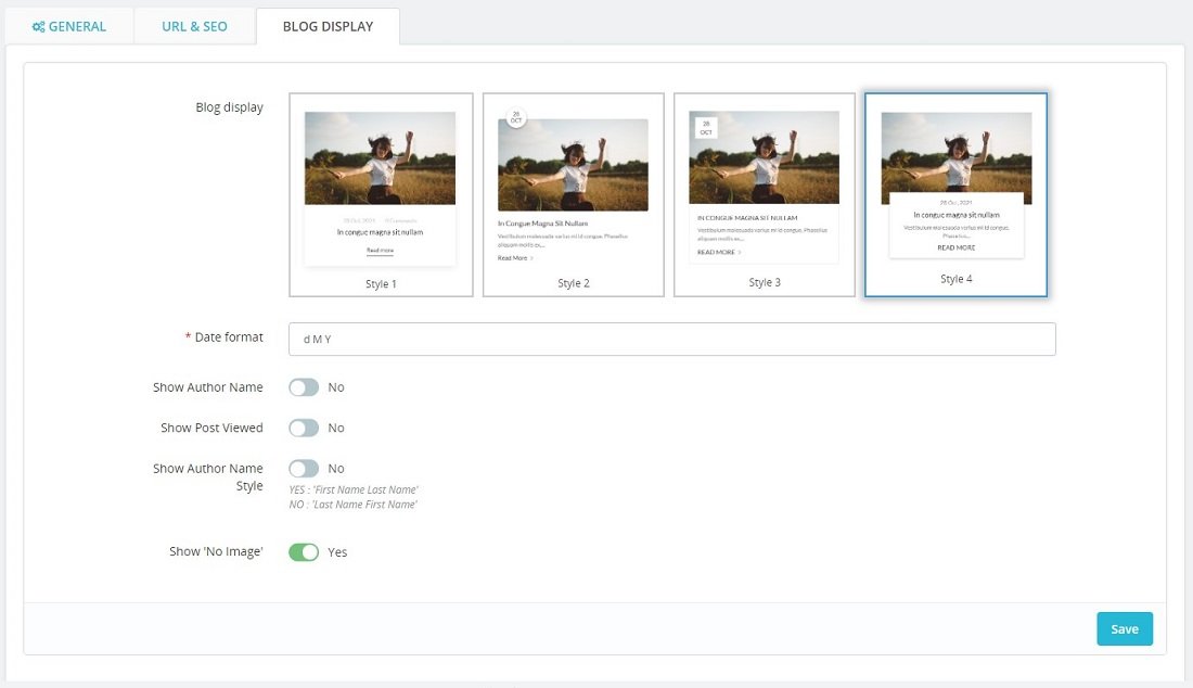
- Blog display: we defined few blog displays in homepage and blog page. You can select one of them.
- Date format: define how post's public date display. Learn about date time format here. Example: d M Y will display: 01 Apr 2022
- Show Author Name: show author name in post
- Show Post Viewed: show viewed count in post
- Show Author Name Style: author name display.
- Show 'No Image': show 'No image' image when post doesn't have image.
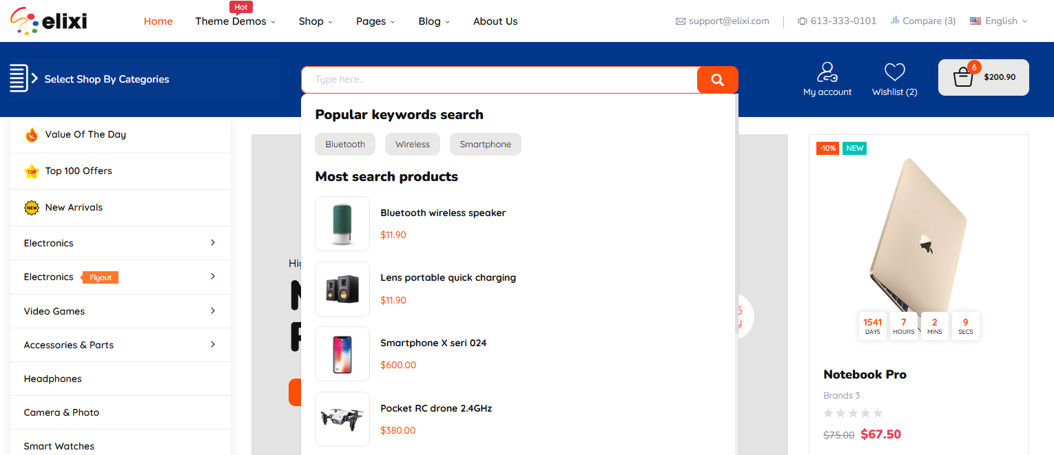
Vec - Search bar
You go to Backoffice > Module manager > configure "Vec - Search bar"
or quick access in Backoffice > ThemeVec > Modules > Ajax Search
Configurations
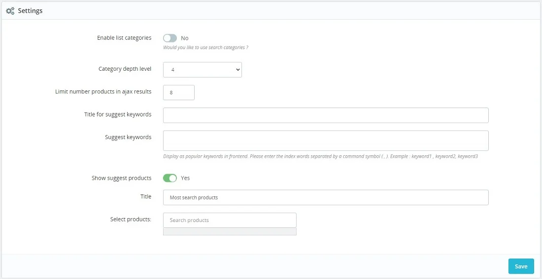
- Enable list categories: Select Yes to activate the search by category.
- Category depth level: Select the depth level of categories which you want to show in search.
- Limit number products in ajax results: Limit the number of products in search results. Default: 10
- Title for suggest keywords: Add a title for suggest keywords.
- Suggest keyword: Add the suggest keyword to display. Please enter the index words separated by a command symbol ( , ). Example : keyword1 , keyword2, keyword3
- Show suggest products: Select Yes to use suggest products section.
- Title: Add title for suggest product section.
- Select products: You just fill name and select products which you want to show.
Newsletter popup module
You go to Backoffice > Module manager > configure "Vec - Newsletter popup"
or quick access in Backoffice > ThemeVec > Modules > Popup newsletter
Configurations
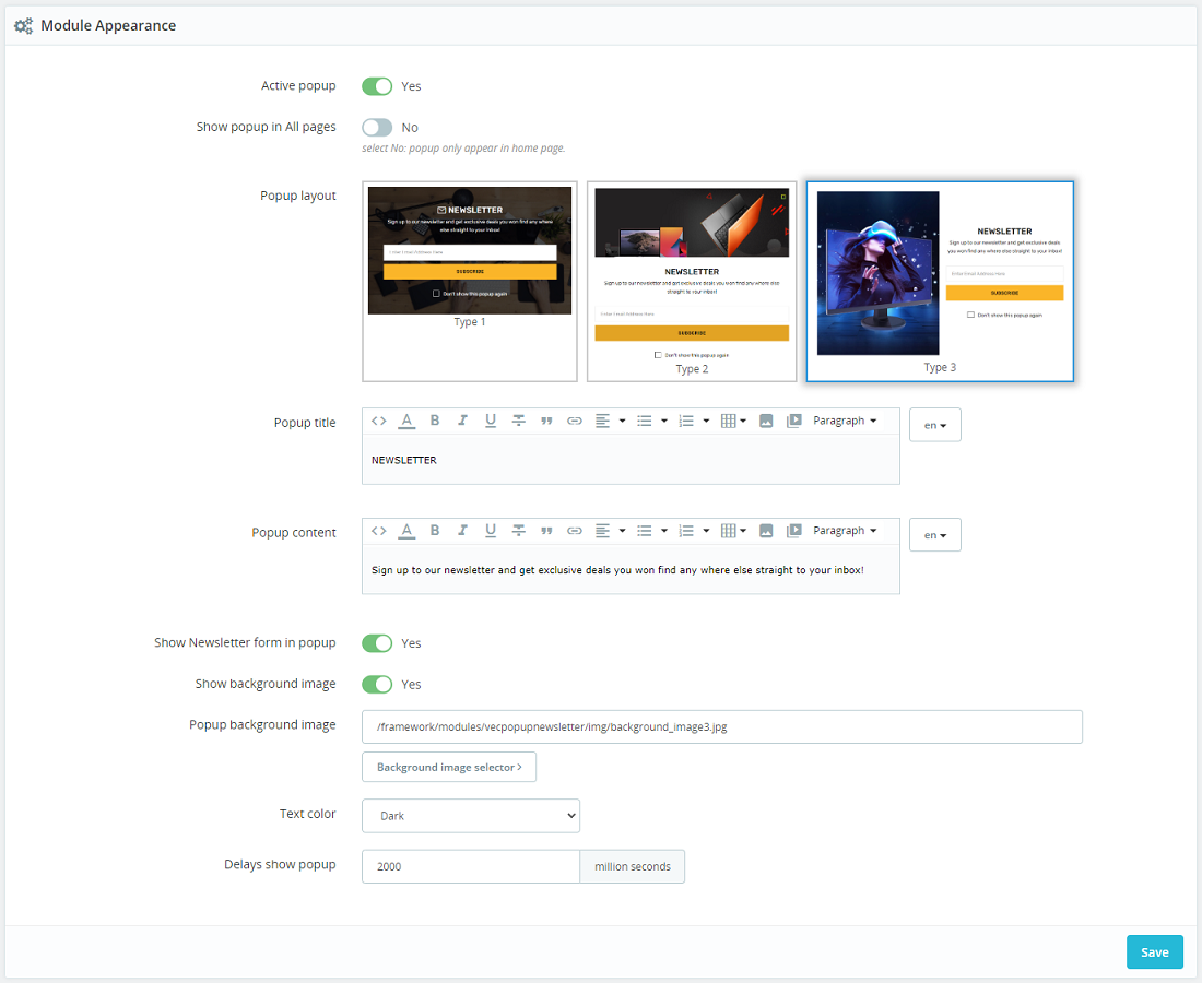
- Active popup: Enable/disable the popup
- Show popup in all pages:
- Yes: the popup able to be shown in any pages.
- No: the popup will be shown in homepage only.
- Popup layout: We defined few popup layouts. You just select one of them.
- Popup title: Add a title to display at top of content.
- Popup content: Add text content for the popup.
- Show newsletter form in popup:
- Yes: Display newsletter in popup content.
- No: Don't use newsletter in popup. The popup only show title and text content.
- Show background image: Use image background for popup. Select image in Popup background image field.
- Text color: We defined 2 style: dark and light. Depend on the popup background, you can select dark or light text.
- Delays show popup: Define how long the popup will be shown ( unit: miliseconds )
Vec - Shopping cart
You go to Backoffice > Module manager > configure "Vec - Shopping cart"
or quick access in Backoffice > ThemeVec > Modules > Shopping cart
Configurations
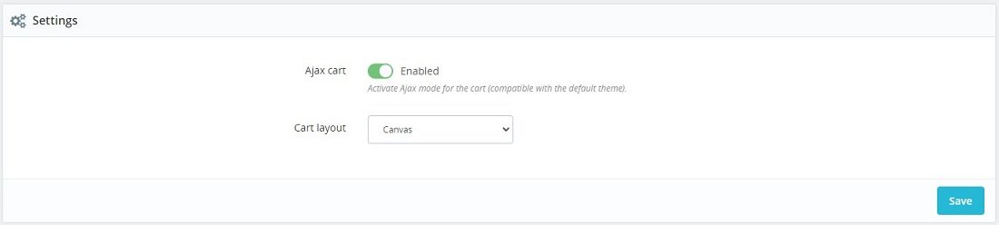
- Ajax cart:
- Enable: Active ajax cart when press Add to cart button.
- Disable: When press Add to cart button, the page will direct to shopping cart page.
- Cart layout: We definded 2 cart layouts:
- Canvas: click cart icon in header, the mini cart will show at right side of page.

- Dropdown: hover cart icon in header, the mini cart will show as dropdown
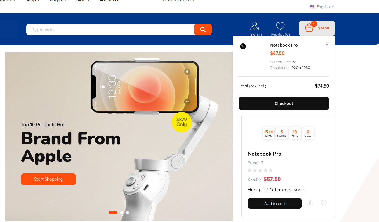
- Canvas: click cart icon in header, the mini cart will show at right side of page.
Other modules
Other modules have simple configurations for understanding, so we don't add them here. If you have any questions, you can contact our support in email: thl231195@gmail.com . We always ready to answer all your questions.
Theme icons
To use the our theme icon , just copy below code and replace "elicon-phone" by the icon name.
<i class="elicon-phone"></i>
This is list of theme icons:
Performance
This section contain tips that might help you improve your shop's performance server-wise. We recommend you to enable these cache options only when you finish all necessary configuration actions
Recommended settings for working in production shop:
Vec
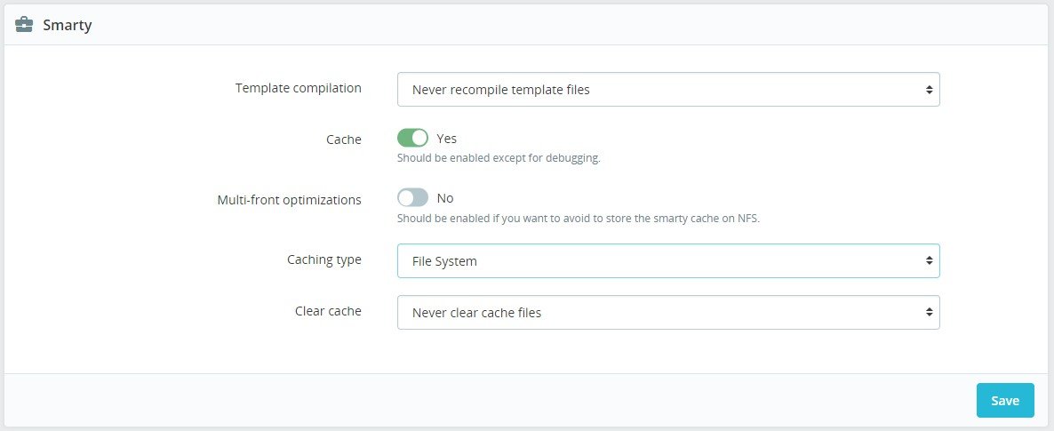
- Template cache - Never recompile template files. Prestashop stop spending time for checking every file for modification to recompile it
- Cache - Enabled
- Caching type - File System
- Clear cache - Never clear cache files
Debug Mode
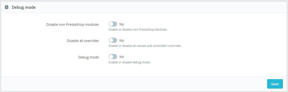
- Debug Mode - No. By enabling this option, technical error messages will be visible. It is useful when you are being helped by someone who does not have access to your shop but who needs to know what is going on technically.
Media. Combine, Compress and Cache (CCC)
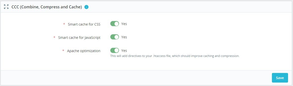
- Smart cache for CSS - On. Combine and compresse CSS files
- Smart cache for JavaScript - On. Combine and compresse JS files
- Apache optimization - On. This setting will change your web server's configuration file in order to make it more efficient for CCC.
Technical details
Performance detailed description
Additional Optimization
Optimize your PrestaShop performance
Optimization from canonicalized.com
Prestashop Speed Optimization – How to make it insanely fast!
Support
If this documentation doesn't answer your questions, so, please contact our support team at email: thl231195@gmail.com
We are located in GMT +6:00 time zone and we answer all questions within 6-12 hours in weekdays.
Don’t forget to Rate our theme
Go to your Themeforest Profile & then You can Rate & Review for our template.
Thank You in advance!
Changelog
Version 1.0.0 (15 January, 2025)
Initial Release